
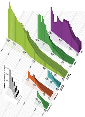
Data Visualization and Infographics have always been my favourite. Weirdly it is a domain in graphic design that is not yet so appreciated as other domain (such as motion, illustration or webdesign) although they closely relate. I guess that's mostly to be explained because Data Visualization and Infographics come from 'originate' (or were formerly mostly used) in the science-field. Scientists (and offcourse sociologists and researchers of various fields as well) needed it and worked with them without knowing design or consulting designers about it. It was a purely functional 'thing' they must have thought, anyway that is all starting to change (or has allready I suppose, Data Visualization and Infographics starts to emerge as a master degree in universities all over the world) - after all form doesn't always follow function, form can be used as an extra explanatory guide to the function. Or better, design can (or rather) must serve the data in order to make the information more legible and/or readable. If design serves to easier access for the data displayed, then it is certainly worthwhile examining the different design-possibilities for the Data Visualization. (check Query bursts)
No comments:
Post a Comment