31 July 2008

Melmac


New logo
Originally uploaded by Melmac Studio.

Gravity_Failure


Gravity_Failure
Originally uploaded by jasperio.

Collaboration with fellow designer and friend Ralph A Jensen

Be sure to check out the full view for a better look.

Commen/feedback are as usual always welcome :)

www.jasperwiese.com
jasperio.deviantart.com

Flint cops crack down on sagging pants


Quick – call the fashion police! It’s a crack down! Apparently it’s not a hoax but police in Flint, Michigan are attempting to enforce a seemingly crazy ruling, based on indecent exposure law, whereby sagging trousers could result in a stern warning, a fine, or even a prison sentence, depending on just how much buttock is on show. This helpful infographic appeared in the Detroit Free Press so that readers could be fully aware of the legality of their, er, position.

via CR

Bycicle, bycicle, I want to ride my ...


The so called king of cool, lives (according to my dear friend Shapish) at Avenue B, NYC. And he/she drives a very hot Bycicle! yeah

Edwin Tofslie


Very nice one-page portfolio by Edwin Tofslie, really like the floating navigation. Check his blog too he post some funny stuff

Cristiano Cora


"I'll have the coupe-classique, and some sunglasses please, oh and you can leave the sidebeards on, tnx."

Cristiano Cora is some fancy hairdressing salon at 3 West 13th Street, NYC. the interior is designed by architect Avi Oster.

Institute for Dynamic Educational Advancement

The Institute for Dynamic Educational Advancement (IDEA) is a nonprofit organization that recognizes the Internet’s potential to transform the learning process by making information accessible and engaging. The organization is dedicated to identifying unique challenges that prevent the Web from reaching its educational potential, and developing creative, innovative approaches and technologies to solve those problems.

Utilizing a multidisciplinary approach that is both innovative and bold, IDEA undertakes programs and projects designed to promote the interaction between people and information within the framework of technology. Our endeavors range from gathering and presenting useful information to the public; to building upon the body of research on the relationships between learning, information, and technology; to developing technological tools that break down the barriers between people and computers. Most often, they incorporate all three elements.

IDEA now released a white paper on Factors that improve online experiences and touch certain topics that you might want to dive into:
• Designers underestimate the thresholds for an effective site
• Easy access to complete information is key to visitor enjoyment
• Good visual design and up-to-date information are critical
• Visitors want information fast
• Visitors want a broad range of topics
• Designers are overly optimistic about visitors’ ability to maintain orientation
• Visitors still need handholding
• Visitors point to the lack of breadth and depth of site content as causing an “Information Gap.”

The focus is on the question; How do we find information? I could add maybe; what information do you rate as "valuable" or rather "plausible". Systems as Wikipedia kinda worked the trick but yet not always. That could add up to go in the direction of thinking; with which tools do we find the information, and who develops and controls these tools, and off course do you take for granted that the information they push as plausible is not edited by the once that are in charge... we are thinking Google mainly, yes. (and I'm referring to things as pageRank and such, that we assume are honest top refferals for valid information)

25 July 2008

Silverback - guerilla usability testing


Usability testing is last on everybody’s list of priorities. It’s time-consuming, can require specialist equipment, and is expensive to outsource. Not any more.

Silverback makes it easy, quick and cheap for everyone to perform guerilla usability tests with no setup and no expense, using hardware already in your Mac.

Spontaneous, unobtrusive usability testing software for website designers.
* Capture screen activity
* Video the participant’s reactions
* Record the participant’s voice
* Add chapter markers on the fly
* Control recording with the remote
* Export to Quicktime

Awesome !!!

24 July 2008

Zitvlaai vs Shitbox


In Belgium radiostation StuBru and MortierBrigade introduced the "Zitvlaai" (freely translated into ShitSit) as being the ideal sitpillow for the summerfestivals. A soft plastic piece in the shape of cowshit says to be nicely supersoft, yet uneatable and though not intended to be inserted into a cow's ass..


In Britain The Brown Corporation recently introduced the ShitBox. Of course this gadget is taken more seriously than the ShitSit, but ailed more to very practical needs. Being handy is another pair of sleeves.

The ShitBox is a lightweight portable cardboard toilet, made specifically for outdoor use. The box pops up from a convenient 14 inch flat pack to a rigid, reusable, comfortable toilet. Each box comes with ten degradable poo bags. woohoo!

Hijacked Mag


Hijacked is a new publication presenting the most diverse and provocative new photography from Australia and America. Hijacked’s aesthetic is directed by the mindset and energy of young and emerging practitioners — embracing the prevailing wanderlust, their work exhibits a fascination with international subcultures, fragmented trends, alternate life styles and urban landscapes.

Mr Doob


Mr Doob has some very nifty stuff posted to his blog/portfolio, amongst a lot of 3D and Flash-projects there'r lots of nice graphics as well. Oh btw he was awarded "best website ever" by the PWA :)

23 July 2008

NEW PURCHASE - Sauna Font


Typefondry and design-agency Underware had struck my attention from the first encounter I had with their work back in Typo Berlin 2006. Some very fresh typeface designs and additionally very funny applications of graphics that promoted the branding and promo of these typefaces.

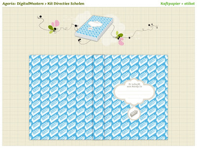
Sauna became an instant favorite of my font-collection and now finally I had the chance to put this fontface into practice for a project. I branded the Digital Masters campaign of Agoria, a campaign that pushes image-building of IT-jobs. The campaign isn't live yet but will be very soon, and I really couldn't resist giving you a sneakpeak on the artwork I created since I've received this supersweet booklet that comes along with the purchase of the Sauna font with which I designed the logo and housing style of the Digital Masters.


Great Color Legends


Some colors become huge successes early on and then fade off into obscurity… while other colors go the distance and become international icons.

Read more about the great color legends…

Why is the US Dollar Green? Why is Red the International Color for Stop? Why is Pink a Girl Color and Blue a Boy Color? Why are Republicans Red and Democrats Blue? Why is the Green M&M the Horny One? Why is Purple a Lesbian Color? Why is Black the Color of Death? Why is the Sky Blue? Why are Road Signs Green? St. Patricks’s Green? Why is Raising a White Flag the Symbol for Surrender? Why is Envy a Green Monster? Why is Ferrari Red Iconic of Sports Cars? Why Are Mental Institions Light Green? Why Are Highlighters Bright Yellow? Why Does a Guy Get Blue Balls? Why is Purple A Royal Color? Why is The Red Cross, Red? Why Does the Tour de France Leader Wear a Yellow Jersey? Why Do US Imigrants Apply for a Green Card? Why Does a Bride Need Someting Blue on her Wedding Day? Why Do Masters Golf Tournament Winners Get a Green Jacket? Why Do Wear a Yellow Ribbon to Support the Troops? Why Are Some Americans True Blue?

All this and much more at ColourBlog

22 July 2008

pinup


pinup
Originally uploaded by jonjonsnipes.

it's cold outside so let this heat up your summer a bit

Awards Shows and Credit

A pending issue in current development of "our" creative industry (design and advertising industries taht is) and I totally agree on the Barbarian statement on this issue: ( because, THERE'S MORE TO ADVERTISING THEN "JUST" THE IDEA! )

"First and foremost, I think this absolutely is an area that needs to be worked out. Change will be needed, no doubt. There’s a prevalent (though decreasingly so) viewpoint in the traditional agency world that interactive production is pretty much like traditional broadcast production, and that this has been pretty much all worked out, and there’s no reason to change it for interactive. There’s some logic to this, on some level, and also it’s of course in the interest for the traditional agencies to preserve this thinking and arrangement, since pretty much everything’s going to digital, and if the digital agencies got props for the digital, in another ten years or so they’d be screwed.

Then there’s the prism through which we’re looking at this: Cannes, and more generally, agency award shows. What are these? What are they for? What is their part in all of this? Are we talking about “credit” in an abstract sense, or are we talking about who should win the award?"

Read more at Barbarian Blog

17 July 2008

Handy Heddy


Work was serious fun today at Koen's atelier - naughty naughty stylist girl Britt ... btw nice crispy website from Group94. Koen's newyears-card - just done shitting in the woods forrester - is my personal favorite.


© Koen Demuynck

15 July 2008

Favthumbs


Freestyle Labs made your del.icio.us bookmarks visual, and integrated a MobileMe Gallery + it's a del.icio.us mashup, coded by Jamie Hamel-Smith

Avant Garde


"Lubalin designed the typeface Avant Garde for the last of these magazines. The font was not originally designed as a commercial typeface – it was simply the logo for a magazine. Lubalin’s letterforms with tight-fitting combinations reflected Ginzburg’s desire to capture “the advanced, the innovative, the creative.” The character fit was so perfectly tight that they created a futuristic, instantly recognizable identity for the publication. Later he and Tom Carnase, a partner in Lubalin’s design firm, worked together to transform the idea into a full-fledged typeface."

via ThinkingForALiving

And I am a very big fan! > accordingly I created a Facebook-fanpage to honour this font.

14 July 2008

Marcus Ericksson


Marcus Ericksson is Subdisc. And holds up a very strong photography portfolio at subdisc.com. An enthousiastic collegue of mine pointed out that I was well disguised in one of his shooted models. But unfortunatly I am NOT Ace Ventura's alter ego.

The guide keepers


"You are precious guide keepers.
Our new identity system can only work if the execution remains in the control of skilled people who fully understand the brand’s visual codes. Convergence and homogeinity can only be achieved when all visuals principles are applied."

Finally! As a belgian designer it took quiet a few years but now at last there's a bright light shining at the end of the tunnel. Belgium isn't the country with worlds biggest budget, nor with most open and understanding clients. A rather old-fashioned and dull traditional perspective on design kinda overrules which designs gets approved but as the first decade of the 21st century draws to a close a shift is notable (on a concept level, on the otherhand, we manage to get some breakthrough stuff out there though)


Example: one of Belgium's biggest advertisers, Belgacom, now shifted their brands from diversity to unity in their offline appearance. Unfortunatly online corporate visuals and moving along slowly but the full guideline course is still under development.

As I worked in several ad-agencies along the road I've always somehow been confronted with working for Belgacom or Proximus and that really used to suck big time from a design point of view. Horrible guidelines determined the awfull the designs you were obligated to produce from time to time. But at the very moment Coast Design have lauched the brand new styleguide I really dig. Nice use of blobs and typography, consistent use of harmoniously combined colors and tints take designing for this client from horrible to almost delightfull.

Hats off and bow for Coast!

MadInSpain 2008


There are only 63 days left to a MadinSpain conference. Event site has been done and released today by group94. You can still buy a ticket, so if you have planned a trip to Madrid be sure to get one soon! This years lineup is looking really sweet - Farfar, AKQA, Brand New School among others.

Except presentations there will be also an exclusive artwork exhibition created by 10 invited studios and artists from all over the world including us - hooray!

Related links:
MadinSpain’08
The Hejz

Bodycopy of ArsThanea

11 July 2008

Heineken suicide


If Heineken wouldn't be such a piss-beer, maybe it'd work. I'd hang myself knowing that there's nothing else than a Heineken around.

10 July 2008

Rotavacx


Advanced and colour searching tools for flickr

09 July 2008

Typographers writing

The man in blue had the brilliant idea of posting the handwritings of some typographers. Small pitty he didn't manage to get a big load of handwritings togheter but alltiogheter I really like the "concept".

The handwriting of typographers intrigues, it raises so many questions, big and small: Do typographers exert some extraordinary control of the pen that laypersons don't? Does a typographer's handwriting influence the typefaces they produce? Has the rise of digital communications made handwriting redundant? Do modern typographers, born of digital tools, lack the finesse of their more wizened counterparts? If so, does that change the way their type is designed?

Erik Spiekermann for example, probably one of the most renowned typographers still alive, has been involved in every facet of visual communication – practicing, writing and teaching, as well as running his international agency SpiekermannPartners.

He has designed corporate typefaces for Nokia and Deutsche Bahn, as well as the fonts FF Meta, ITC Officina, FF Info, LoType, Berliner Grotesk and many more.


Read full story at themaninblue.com

Thank you Steven for the linkage

07 July 2008

after mastectomy


after mastectomy
Originally uploaded by sentenced2live.

... not a photoshopped image

Burj Dubai construction


Burj Dubai construction
Originally uploaded by Bret Oliver.

In this picture, Burj Dubai is 110 stories above ground and about 400 meters tall. As of March 25 it is 116 stories and about 425 meters tall.

Futurefabric at Airside


Guy Moorhouse is Futurefabric, works as an interactive designer at Airside. and that includes nice portfolio and some simple but nice Prcng-tests

04 July 2008

My type of tiger


... that's exactly her, thank you Pete!

03 July 2008

Famous Almost Famous


For their 1,000th issue, Entertainment Weekly has gathered 1,000 "New Classics" representative of the last 25 years in the realms of books, movies, music, and television. 50 of those new classics are prime matter for discussion among graphic designers: 25 Perfect Movie Posters and 25 New Classic Covers. Thank you Speak Up for all those usefull critical posts and all.

So that's how I accidently saw the poster of Almost Famous pop up into my RSS-reader. It struck me the first second I laid eyes on the word FAMOUS ... and I thaught to myself, nooooooo they didn't. Well of course I secretly admit to get my design-elements, parts, icons and strokes from other places too, as any designer I guess, but then you work, rework it and mash it up and into your own blending so no-one ever notices. Anyway if somebody does notice it, well that's really blogworthy right? It's harder to prove that ideas are "stolen" then to refer in the same way for design-things to be.

And to make a bold statement and piss some people off: the former LG&F totally copy/pasted the word FAMOUS out of the Almost Famous poster and prompt-it to be the logo of there freshly re-build company, a pitty. Well it is in my opinion a very good looking nicely crisp logo, but I noticed and am therefore soooo dissapointed in them.

Almost Famous / Poster design by Pulse Advertising

William Miller is a 15 year old kid, hired by Rolling Stone magazine to tour with, and write about Stillwater, an up and coming rock band. This wonderfully witty coming of age film follows William as he falls face first to confront life, love, and lingo.

Btw: My copywriter really recommends me this movie